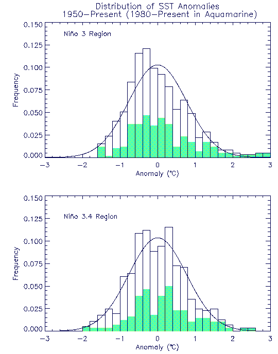

Figure 2 shows histograms of the distributions of SST anomalies for Niño 3 and Niño 3.4 from 1950 to December 1999 relative to the mean for the entire period. The contribution from the post-1979 period is shown by the aquamarine areas. Also given is the corresponding normal distribution with the same variance.